
Unleashing the Power of Data Visualization: Making Sense of Your Numbers
Ever look at a spreadsheet packed with numbers and feel a bit overwhelmed? You’re not alone. Data visualization is essentially about taking those dense, often abstract figures and turning them into something you can actually see and understand. It’s about making complex information accessible and actionable, moving beyond just looking at rows and columns to finding patterns, trends, and insights that might otherwise stay hidden. Think of it as painting a picture with your data, making it speak to you in a clear, visual language.
It’s easy to dismiss data visualization as just making things look nice. But it’s far more impactful than that. Our brains are wired to process visual information much faster than text or raw numbers. When data is presented visually, we can spot relationships and anomalies that would be practically invisible in a table. This isn’t about adding flair; it’s about improving comprehension and speeding up decision-making.
Faster Insight, Better Decisions
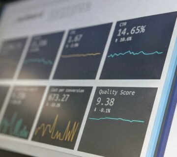
Imagine trying to understand sales performance across 50 products over a year by sifting through a thousand lines of sales figures. It’s a recipe for frustration. Now, picture a bar chart showing each product’s sales trend. You can instantly see which products are booming, which are struggling, and where the peak seasons are. This immediate understanding allows for quicker identification of opportunities and threats, leading to more informed and timely decisions. This is the core benefit: making sense of complexity at a glance.
Spotting the Unexpected
Sometimes, the most important findings are the ones you weren’t looking for. Visualizations can highlight outliers or unexpected correlations that might go unnoticed in numerical data. A scatter plot might reveal a surprising link between two seemingly unrelated metrics, prompting further investigation. This ability to uncover the unforeseen is a powerful catalyst for innovation and problem-solving. It’s about allowing the data to surprise you in insightful ways.
Communicating Complex Ideas Clearly
Trying to explain a complicated data-driven concept to someone who isn’t immersed in the numbers can be a hurdle. A well-crafted visualization acts as a universal translator. Whether it’s illustrating the impact of a marketing campaign or explaining the feasibility of a new project, a chart or graph can convey the essence of the information much more effectively than a lengthy report. This shared understanding is crucial for collaboration and buy-in.
For those interested in the intersection of data visualization and precious metals, a related article that delves into the significance of gold as a valuable resource and its various applications can be found at here. This article provides insights into how data visualization techniques can enhance the understanding of gold’s market trends and its role in various industries, making it a valuable read for anyone looking to deepen their knowledge in this area.
Choosing the Right Tool for the Job: Not All Charts Are Created Equal
The world of data visualization offers a vast array of chart types, and picking the right one is critical. Using an inappropriate chart can obscure meaning or even mislead. The goal is always to select a visual representation that best highlights the specific message you want to convey.
When to Use What: A Quick Guide
- Bar Charts: Excellent for comparing discrete categories. Think comparing sales figures for different products, or website traffic from various sources. They work well when you have a limited number of categories.
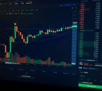
- Line Charts: Ideal for showing trends over time. Stock prices, temperature fluctuations, or website visitors month by month are prime examples. They emphasize continuity and change.
- Pie Charts: Best when you want to show proportions of a whole. For instance, market share for different companies or budget allocation. However, they can become difficult to read with too many slices.
- Scatter Plots: Useful for identifying relationships between two numerical variables. Do higher marketing costs correlate with higher sales? A scatter plot can help answer that. They are great for spotting correlations.
- Histograms: Show the distribution of a single numerical variable. How are your employees’ ages distributed? Or the delivery times for your packages? Histograms reveal the frequency of data points within specific ranges.
Beyond the Basics: When to Explore
- Heatmaps: Great for showing patterns and correlations across a matrix. Think of website user engagement across different sections of a page at different times of day. They use color intensity to represent data values.
- Treemaps: Effective for displaying hierarchical data and comparing proportions within the hierarchy. Imagine showing the revenue breakdown of a company, from overall divisions down to individual product lines.
- Network Graphs: Useful for visualizing relationships between entities. If you’re examining social networks, customer relationships, or collaboration patterns, network graphs can reveal connections.
The Process: Turning Raw Data into Insightful Visuals

Creating effective data visualizations isn’t just about picking a chart type; it’s a thoughtful process. It involves understanding your audience, defining your questions, and cleaning your data rigorously.
Understand Your Audience and Your Goal
Before you even think about charts, ask yourself:
- Who am I trying to communicate with?
- What do they already know about this data?
- What specific question am I trying to answer?
- What action do I want them to take after seeing this visualization?
The answers to these questions will guide your choices about chart type, complexity, and the level of detail required. A presentation to executives will look very different from a deep dive for a data analysis team.
Data Preparation: The Unsung Hero
Garbage in, garbage out. This old computing adage is especially true for data visualization. If your data is inaccurate, incomplete, or inconsistent, your visualizations will be misleading.
- Cleaning: This involves identifying and correcting errors, inconsistencies, and duplicates.
- Transformation: You might need to aggregate data, create new variables, or change formats to make it suitable for visualization.
- Structuring: Ensure your data is organized in a way that makes sense for the type of visualization you intend to create.
This stage often takes the most time, but it’s absolutely crucial for producing trustworthy insights.
Iterative Design: Refine and Improve
Data visualization is rarely a one-and-done activity. It’s an iterative process of building, reviewing, and refining.
- Draft your first visualization: Get something down on paper (or screen).
- Review and critique: Does it clearly answer your question? Is it easy to understand? Is anything confusing?
- Seek feedback: Ask others (especially those from your target audience) for their impressions.
- Make adjustments: Based on your critique and feedback, tweak the chart type, colors, labels, and overall design.
This cycle of creation and refinement ensures your final visualization is as effective as possible.
Tools of the Trade: From Spreadsheets to Sophisticated Platforms

You don’t need to be a coding wizard to create compelling data visualizations. A range of tools are available, catering to different skill levels and needs.
Everyday Tools for Quick Insights
- Spreadsheet Software (Excel, Google Sheets): Most people have access to these, and they offer basic charting capabilities. They are excellent for quick, ad-hoc visualizations of smaller datasets. You can create bar charts, line charts, scatter plots, and more with relative ease.
- Presentation Software (PowerPoint, Google Slides): These tools also have built-in charting features, useful for embedding simple visuals directly into presentations.
Stepping Up Your Game: Dedicated Visualization Tools
- Tableau: A powerful and popular tool that allows for drag-and-drop creation of interactive dashboards and visualizations. It’s known for its user-friendliness and ability to handle large datasets.
- Microsoft Power BI: Similar to Tableau, Power BI integrates well with other Microsoft products and offers robust data modeling and visualization capabilities, often favored in business environments.
- Qlik Sense: Another strong contender in the business intelligence space, offering in-depth data exploration and visualization.
- Python Libraries (Matplotlib, Seaborn, Plotly): For those with programming skills, these Python libraries offer immense flexibility and customization for creating highly tailored and complex visualizations. They are essential for data scientists and analysts who need fine-grained control.
- R Libraries (ggplot2): R is another popular statistical programming language, and
ggplot2is a widely respected library for creating elegant and informative graphics.
The best tool for you will depend on your budget, technical expertise, the complexity of your data, and the desired level of interactivity.
Data visualization plays a crucial role in understanding complex data, and for those interested in exploring this topic further, a related article can provide valuable insights. For instance, the piece on China’s global economic power discusses how data visualization techniques can effectively illustrate economic trends and shifts in power dynamics. You can read more about it in this informative article here. This connection highlights how visual data representation can enhance our comprehension of significant global issues.
Common Pitfalls to Avoid: Don’t Let Your Visuals Mislead
| Category | Metric | Value |
|---|---|---|
| Data Visualization Tools | Number of Tools | 50 |
| Usage | Percentage of Data Analysts Using Data Visualization | 80% |
| Effectiveness | Percentage of Improved Decision Making with Data Visualization | 75% |
While data visualization is powerful, it’s also easy to fall into traps that can misrepresent your data or confuse your audience. Being aware of these common mistakes can help you create more effective and trustworthy visuals.
The Danger of Misleading Axes
- Truncated Y-Axis: Starting the y-axis at a number other than zero can exaggerate small differences between data points, making them appear more significant than they are. For example, showing a difference of 5% as a huge jump because the axis starts at 90%. Always consider if starting at zero is appropriate for your data comparison.
- Inconsistent Scales: When comparing multiple charts, ensure they use the same scale for their axes. Differing scales can create false impressions of disparity or similarity.
Chart Junk and Overcrowding
- Too Much Information: Packing too many data points, variables, or labels onto a single chart can overwhelm the viewer. The focus gets lost, and it becomes difficult to discern any clear message.
- Unnecessary Decorations: Excessive use of 3D effects, shadows, gradients, or gratuitous graphics can distract from the data itself. These elements are often referred to as “chart junk” and detract from clarity.
Poor Color Choices
- Inappropriate Color Palettes: Using colors that are too bright, too many colors, or colors that lack contrast can make a chart hard to read. Consider colorblindness when selecting your palette.
- Misuse of Color Intensity: Using color intensity to represent magnitude works well for heatmaps, but applying it arbitrarily can be confusing. Ensure the color mapping is intuitive and clearly explained.
Ignoring the Story
- Data Without Context: Even the most beautiful visualization is meaningless without context. Always provide clear titles, axis labels, and annotations that explain what the data represents and what insights can be drawn from it.
- Forgetting the “Why”: A visualization should tell a story. If it doesn’t lead the viewer to understand something or consider a question, it’s likely not as effective as it could be.
The Future is Visual: Embracing Data Storytelling
As data becomes even more pervasive, the ability to communicate insights effectively will only grow in importance. Data visualization is no longer just a nice-to-have; it’s a fundamental skill for anyone working with information.
Beyond Static Images: The Rise of Interactivity
The trend is moving towards interactive visualizations. Dashboards that allow users to click, filter, and explore data in real-time are becoming the norm. This empowers individuals to ask their own questions of the data and discover insights tailored to their specific needs. Interactivity transforms passive viewing into active discovery.
AI and Automation in Visualization
Artificial intelligence is beginning to play a role in data visualization, with tools that can suggest appropriate chart types, automatically identify trends, and even generate narrative summaries of data. This can democratize visualization further, making it accessible to an even wider audience.
Data Storytelling: The Ultimate Goal
Ultimately, the goal of data visualization is not just to present numbers, but to tell a compelling story that drives understanding and action. By mastering the principles of effective visualization, you can unlock the true power within your data, making informed decisions and communicating your findings with clarity and impact. It’s about making data work for you, not against you.


لا يوجد تعليق